By TREVOR HOGG
By TREVOR HOGG
Images ©YT/S,D courtesy of GKIDS.
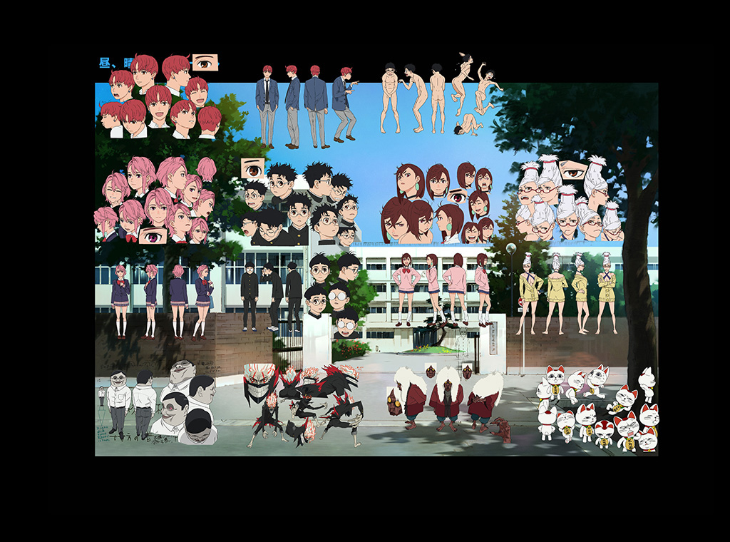
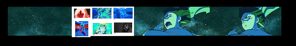
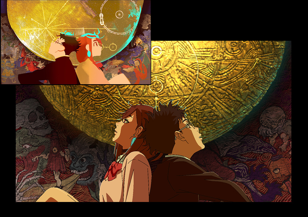
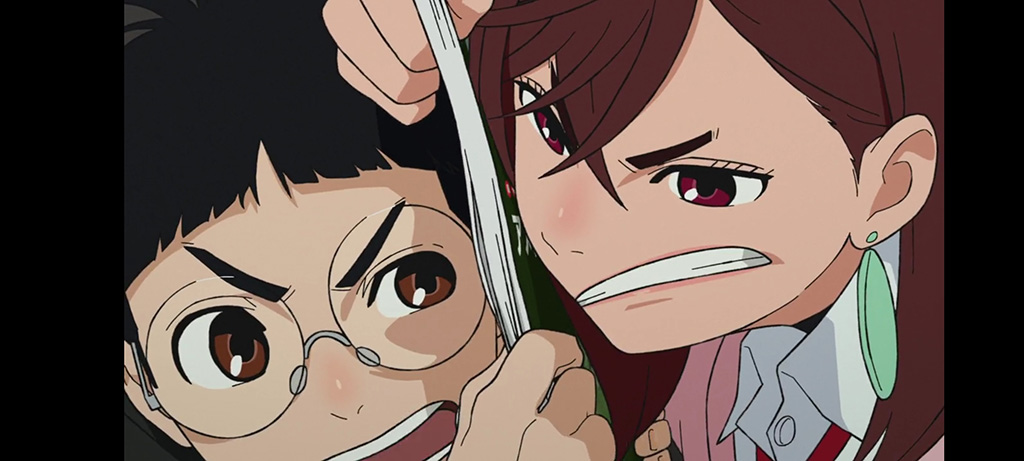
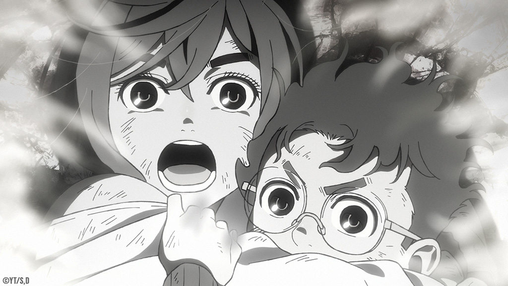
Capturing the spirit of the manga through an off-the-wall hybrid of aliens, yōkai [supernatural beings and phenomena in Japanese folklore] and high school romance is the Crunchyroll, Netflix and GKIDS anime series Dan Da Dan. The original ink drawings of Yukinobu Tatsu have been reinterpreted by director Fūga Yamashiro and Science SARU with a color palette that ranges from monochromatic to muted pastels depending on the theme of the scene in question. The story revolves around a dare between two classmates resulting in one becoming possessed by an evil spirit while the other is abducted by intergalactic beings that accidentally unlock her psychic abilities. The unlikely duo face a number of adventures together that cause them to utilize their newly acquired powers and in the process of doing so fall in love.
“There are only so many colors in the world. It is intense when it comes down to Dan Da Dan because when you can put one color on the screen, your options suddenly become limited. The approach right now is to go full throttle every time, and we’ll see!”
—Sophie Li, Color Script Artist, Science SARU
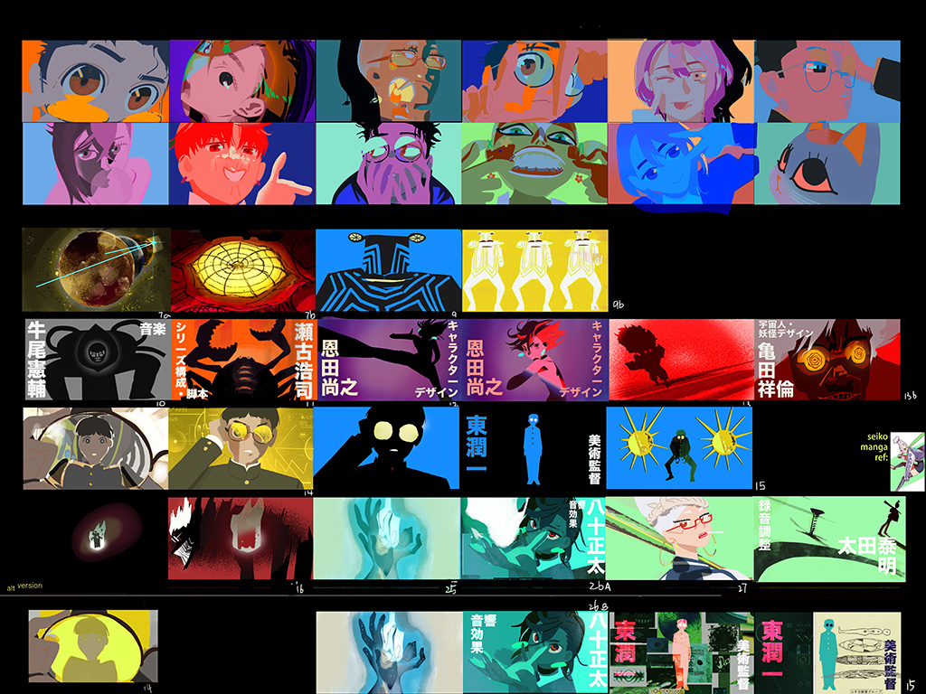
Handling the color design were Satoshi Hashimoto and Makiho Kondo, with the former working on projects such as Spy x Family, Death Note and Paprika. “First of all, I want to talk about briefly the pipeline order in Japanese animation,” states Satoshi Hashimoto, Color Designer at Science SARU. “Basically, what happens is that the colorists, background artists and animators are separated. Then, as things go, first of all the director decides the direction he wants to go in, and he orders the backgrounds based on that. He gets those backgrounds back, then he brings them to us and the color team, and talks about what he wants to do. Then, we make the colors using those backgrounds, based on his and our own ideas.”
Working on a subliminal level is the color script. “It’s more like music,” notes Sophie Li, Color Script Artist at Science SARU. “It’s underlying but conveys emotion, an energy and sometimes story through color. When I start thinking about the colors for a specific show, what is important is to try to understand the tone of the project and the director’s vision; whatever references they are using and how the color in those references work and try to apply the logic into this new show that we’re making. That’s how color script works. It also involves a lot of figuring out light directions. Sometimes, light and dark values in a scene also comes in. When I do the color script, I try to lead with the emotion of the scene. I want the audience to know where we are in the story, and they will remember what the color combination is on the screen. After watching the show, they will know this is the beginning, middle and end of the fight. It progresses clearly, which is something I hope to achieve in the color script.”
“It’s more like music. [The color script] is underlying but conveys emotion, an energy and sometimes story through color. When I start thinking about the colors for a specific show, what is important is to try to understand the tone of the project and the director’s vision; whatever references they are using and how the color in those references work, and try to apply the logic into this new show that we’re making. That’s how color script works.”
—Sophie Li, Color Script Artist, Science SARU
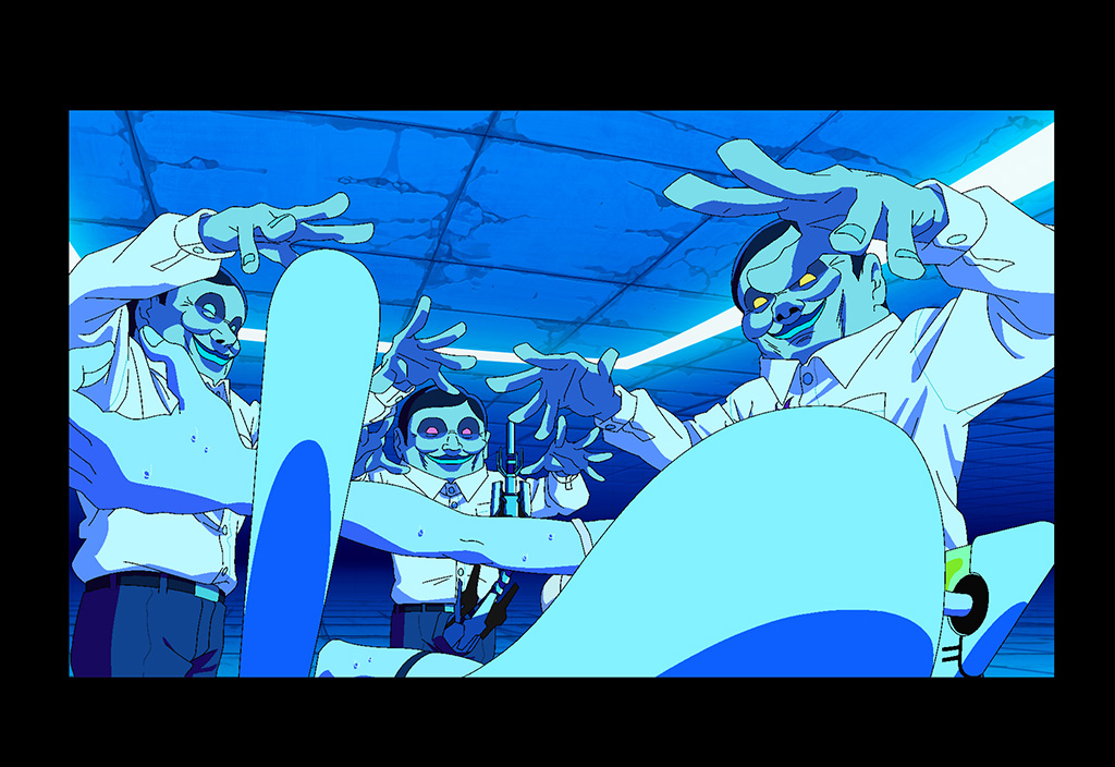
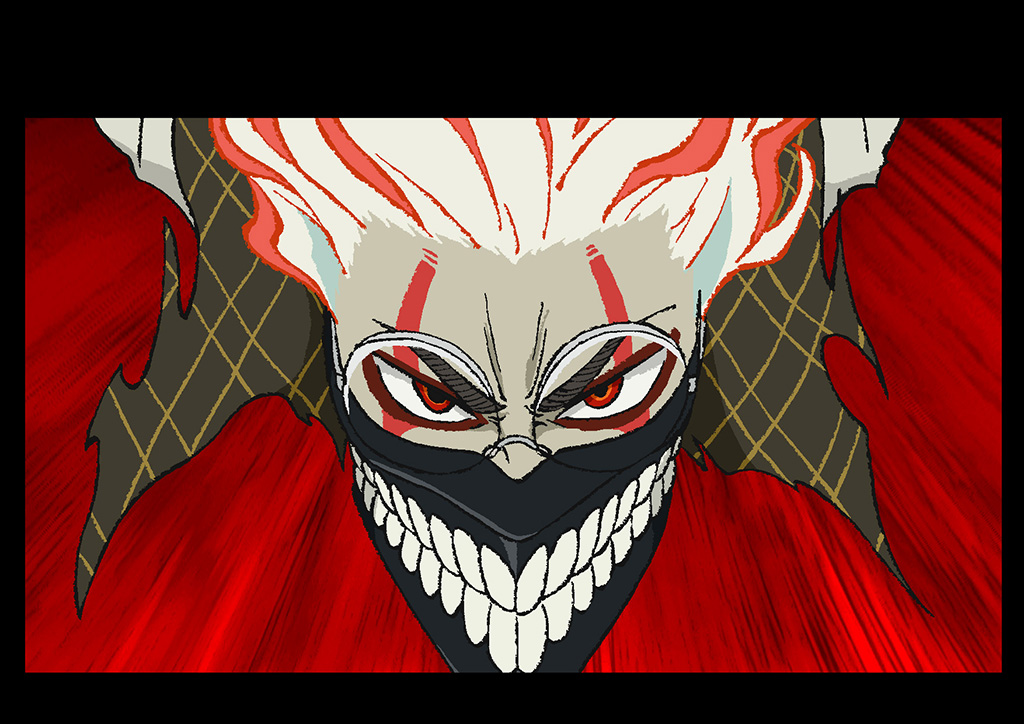
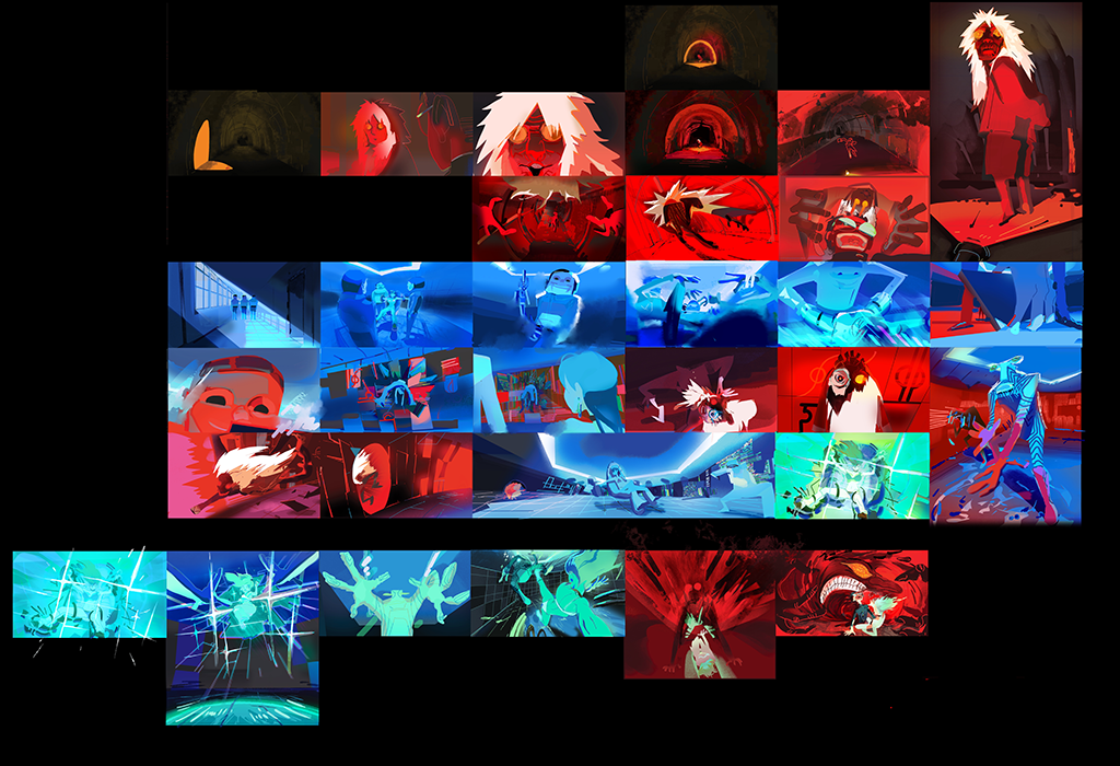
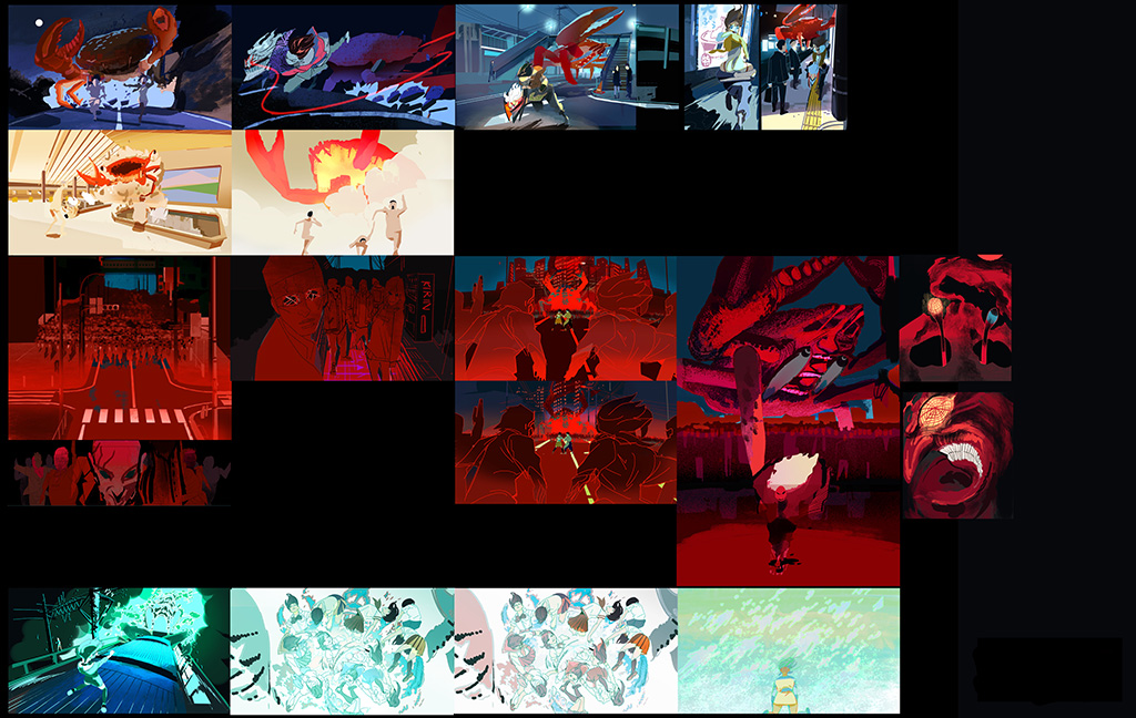
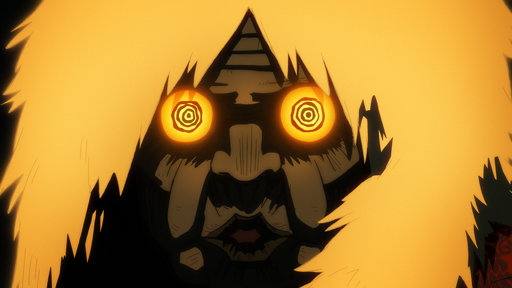
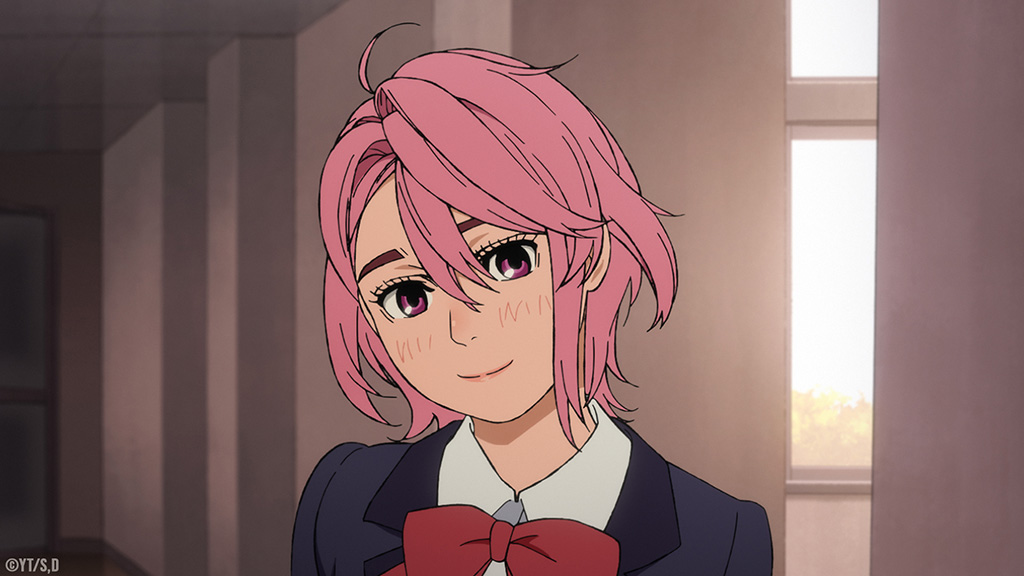
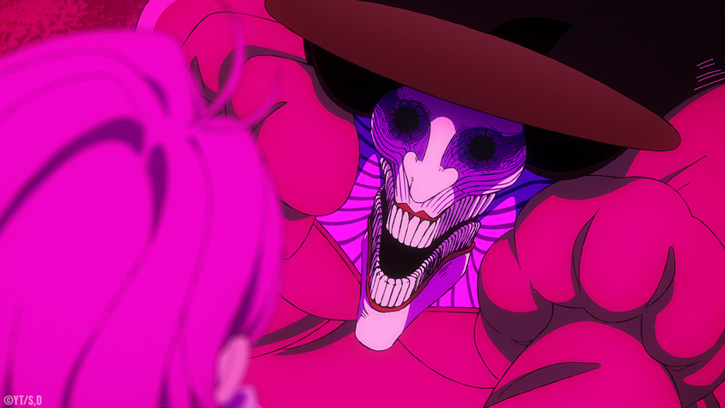
Determining the color palette for each scene is whether the adversary is an alien, yōkai or combination of the two. “I have been with this production since pre-production, so when we were figuring out the direction of the series, I was doing things like image boards,” Hashimoto explains. “Even at the early stages, the director had a strong idea as to what he wanted to do with the color direction for the yōkai and aliens. The idea has always been that the yōkai, for example, Turbo Granny or Acrobatic Silky, are warm colors, like a reddish or pinkish for the characters in question. Whereas, the aliens are the opposite to that. They have colder colors to them; for example, the Serpo aliens that you see in the first episode are bluish. When Okarun is cursed by Turbo Granny, he gets her red color, and you can see his hair and the tips of his cloths turn partially red. Those were all requests from the director.” A retro aesthetic was adopted for the everyday scenes because of the frequent references to Japanese pop culture in the manga. “A lot of Japanese animation nowadays is focused on being flashy, vivid and high saturation all of the time. But this time we wanted to go with a slightly less saturated, more relaxed look for the screen and save that vivid high-saturation, more modern anime look for the action scenes to make them pop.”
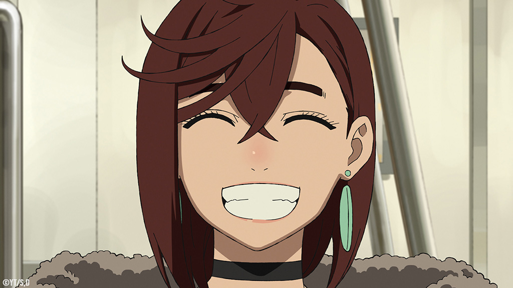
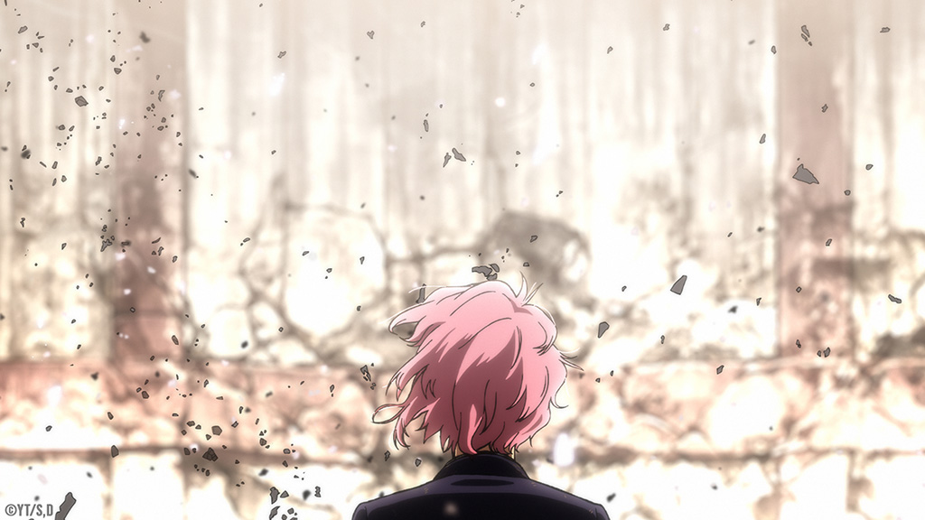
“Dan Da Dan is crazy!” laughs Li. “It conveys so many genres. It was so free even though there were references given by the director, like for his fight scene, which was inspired by a particular fight in Ultraman. It’s important to put myself back in the box and say, ‘This is heavily influenced by older filming techniques and that kind of feeling.’ I think about it as if I’m using a real lightbulb somewhere in the scene and non-digital older colors, too.” A lot of time was spent developing the color language for Episode 101. “When the color is dyeing the whole scene, I try to use lighting to balance it out so you know Momo is under this spotlight and what’s happening. When it’s a running around sequence, the color balance is always hard to keep, like Episode 104 with the big fight with the crab,” Li says.
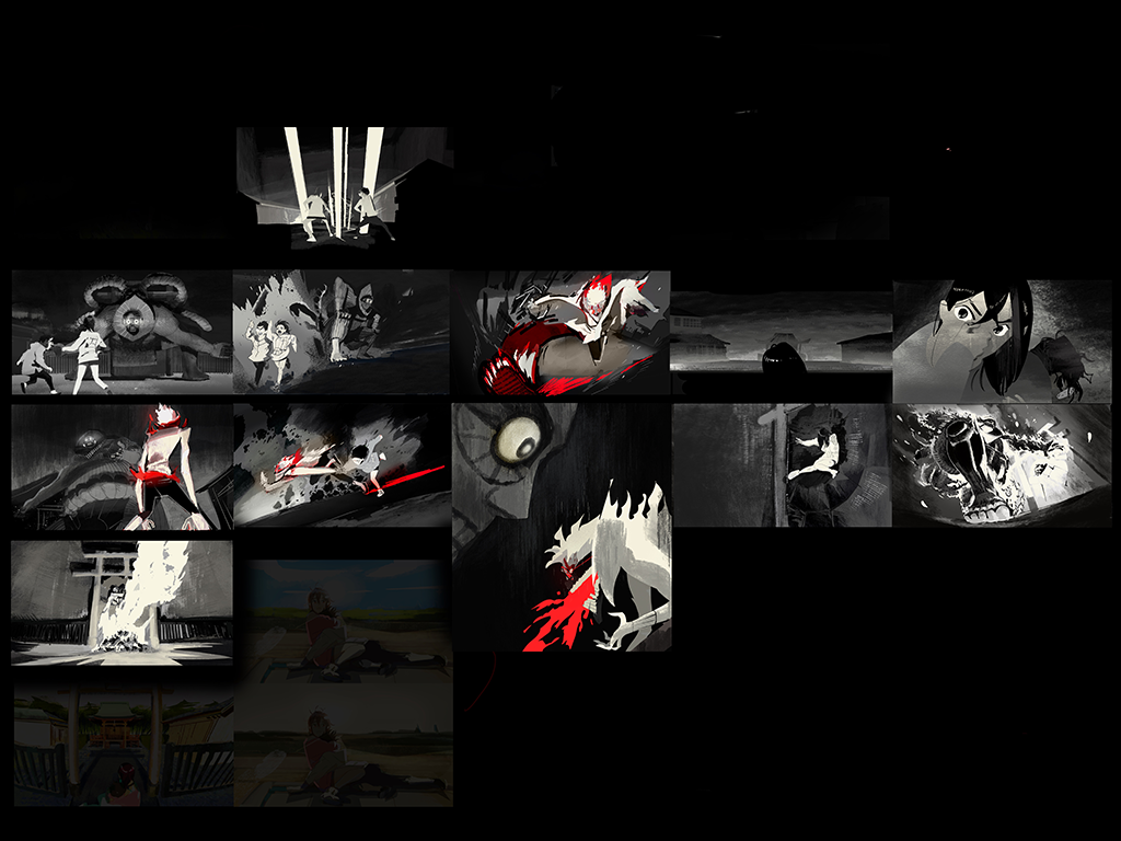
Some of the scenes look like actual ink drawings taken from the manga, “such as the Fleetwood Monster fight, and this applies to some of the other colors that we use as well, especially for black and white where it gets a lot harder to depict depth,” notes Makiho Kondo, Color Designer at Science SARU. “The characters are put into a similar tone, and you have to rely on brightness. It was difficult to construct the screen in a way that even with those colors, it would still have the depth the director was looking for. We ended up having a lot of back and forth with him where he would say, ‘We could make this darker. We can make this whiter or brighter.’ We were doing a lot of individual smaller changes to make sure that we felt the level of depth between the characters or between the characters and the background. Then, the ideas about the insert colors, for example, the red in the scene when Okarun uses his power, and in his hair and face lines; director Yamashiro was particular about having that stand out in any scene he used it in. The black and white was particularly good for helping us have the red stand out.”
“The characters have their colors, and we had to take into account. For example, the auras; if there is going to be effects placed on this in compositing, how is that going to change the color? What are shadows going to look like? A lot of it was working with both the director and compositing team to decide on colors that will still look good even placed under compositing effects or pushed in a different direction. There was a lot of trial and error back and forth to make sure that the final result was what everyone was looking for.”
—Satoshi Hashimoto, Color Designer, Science SARU
The color treatment of effects was determined by the scene itself. “For the regular type of effects, like explosions in normal scenes, we would go with a baseline normal color,” Hashimoto remarks. “But we paid a lot of attention to how the character effects should be influenced by the image colors that a character has. For example, Okarun is using some sort of power, and we flash some red in there. Another big one is Momo’s psychic power; we were using her specific colors for that as well.” Careful attention had to show how digital augmentation would impact the desired color. “The characters have their colors, and we had to take into account,” Hashimoto states. “For example, the auras; if there is going to be effects placed on this in compositing, how is that going to change the color? What are shadows going to look like? A lot of it was working with both the director and compositing team to decide on colors that will still look good even placed under compositing effects or pushed in a different direction. There was a lot of trial and error back and forth to make sure that the final result was what everyone was looking for.”
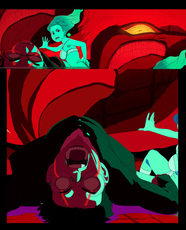
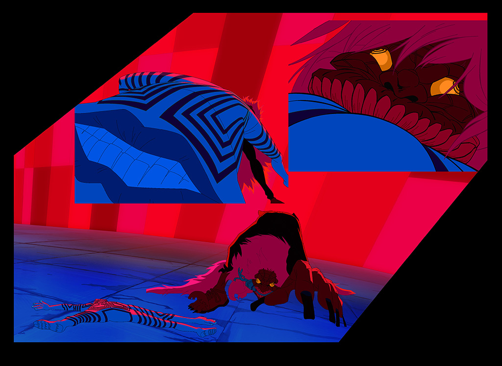
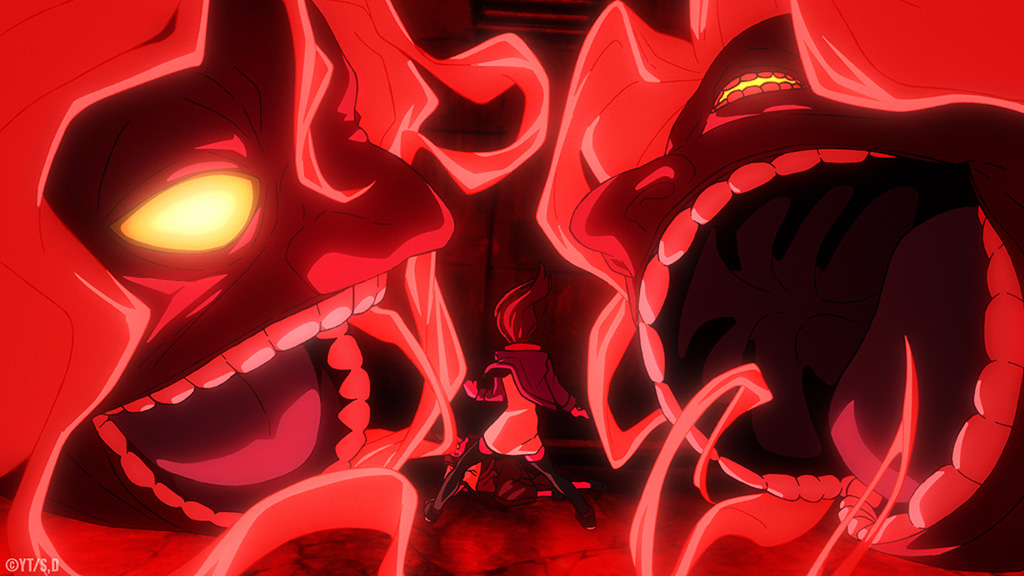
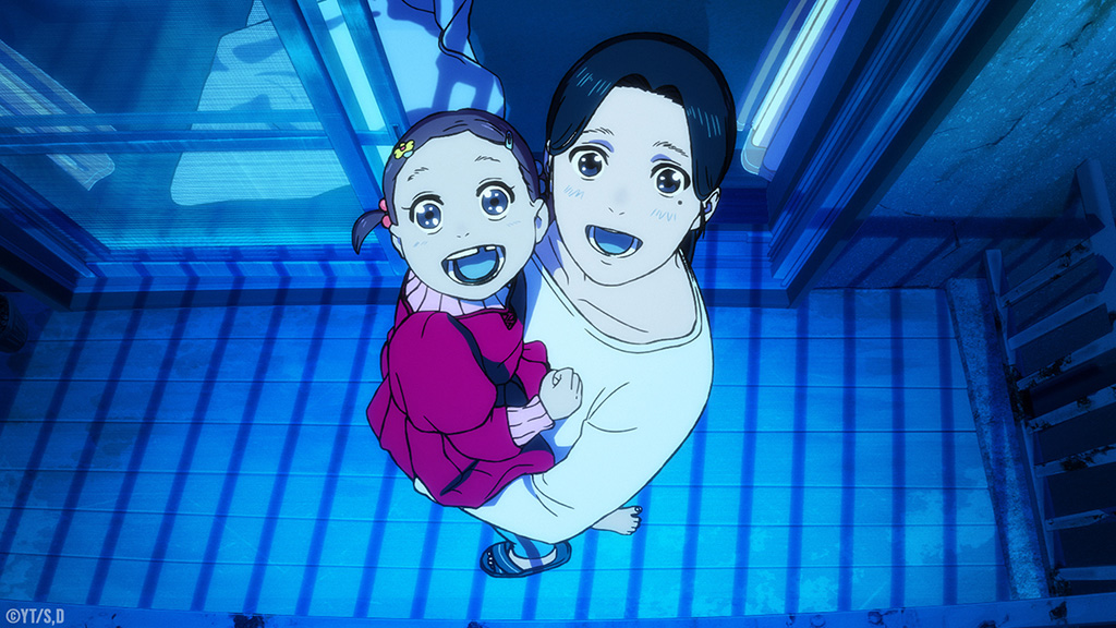
To understand the motivations of characters, backstories are a significant part of the storytelling, and nothing is more tragic than what led to the existence of Acrobatic Silky. “Of course, we had a color script for that which helped to decide the overall direction,” Hashimoto explains. “The way I was thinking about it was that we have the action scenes, and the strong pink was based on grudges Acrobatic Silky was holding; however, when we were dealing with the mother, I wanted to represent the free parts of her life, the times she was spending with her daughter and her truer personality by using the opposite color to pink, which in this case would be a blue. I wanted to create a gap between her true feelings and sadness; for example, her life with her daughter versus the pink you see during the action scenes when she becomes a monster.”
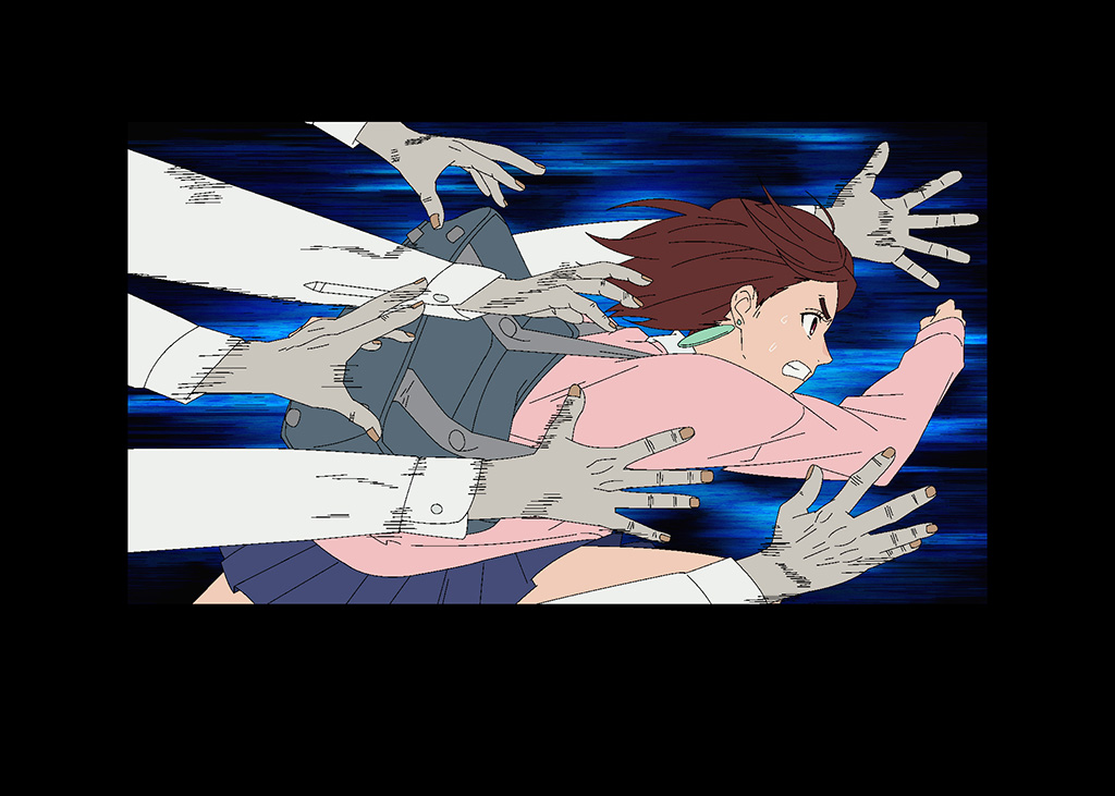
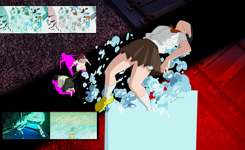
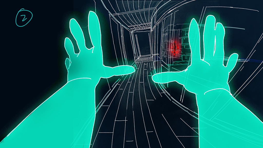
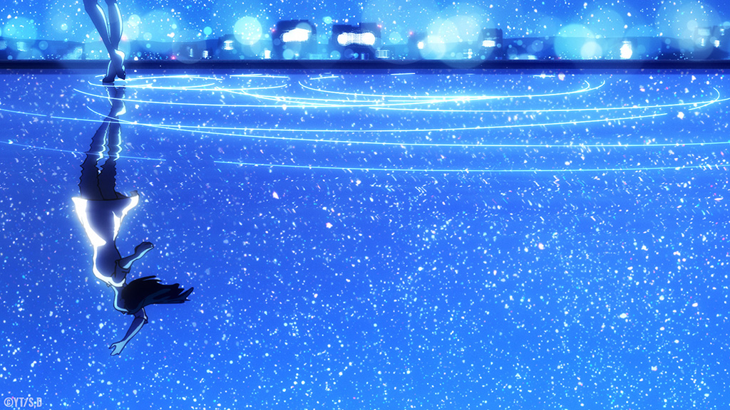
Black and white prevail when Momo uses her psychic powers to find and grab hold of Turbo Granny’s aura. “I had a strong idea already,” Li recalls. “It was more like making concept art. This particular shot was like x-ray vision and simplified lines that inverted the color. I was testing out how the grading of the hand works to make it simple. The main point of that sequence was to make it readable, and nothing matters besides her hands, which are her theme color of turquoise, and the color of the flame of each character. Everything else is black, grey and white lines; that remains consistent every time she uses her powers.” A massive crab goes through different shades of red as it attempts to catch Okarun and Momo. “I tried to think about the different elements and the part of the fight where you have to let your eyes rest a little bit. When the crab is boiled, it is more orange, and when Turbo Granny goes into the final form with the crab, it is more of a darker red. The progression shifts subtly in the show, but when I do the color script, it is more condensed.”
Dan Da Dan has been both challenging and rewarding. “There are only so many colors in the world,” Li acknowledges. “It is intense when it comes down to Dan Da Dan because when you can put one color on the screen, your options suddenly become limited. The approach right now is to go full throttle every time, and we’ll see!”