Images courtesy of Netflix.

Images courtesy of Netflix.
Manga garners most of the spotlight when it comes to anime adaptations, but light novels are also well represented. One notable example is Hiro Yuki’s 20 Seiki Denki Mokuroku, or 20th Century Electricity Catalog, which Kyoto Animation and Minoru Ota adapted into the Netflix series Sparks of Tomorrow. Set in early 20th-century Kyoto during the Meiji era, the series follows two brothers who dream of replacing steam technology with electricity. Their ambitions are cut short when one brother leaves for war and dies on the battlefield. Later, a chance encounter at a shrine brings the surviving brother, Kihachi Sakamoto, face to face with a young girl with an unexpected connection to his late sibling, reigniting his desire to change the world.
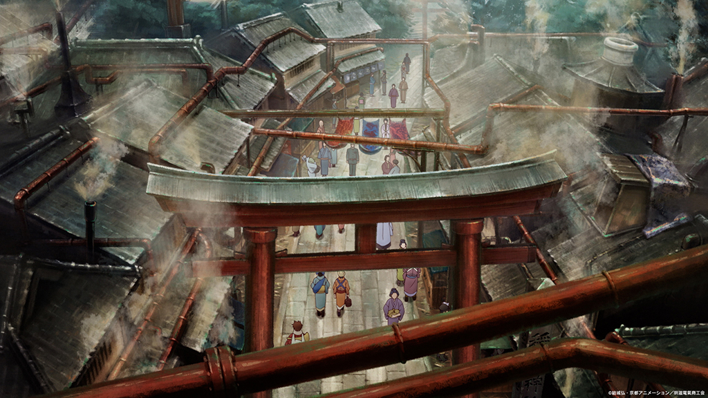
That inventive spirit extends to the series’ animation, which is every bit as innovative as Kihachi’s work with machinery. Naturalistic, chibi and surreal styles are seamlessly intercut, shifting between dramatic and comedic moments, giving Sparks of Tomorrow a distinctive visual identity. “We designed the everyday scenes to feel dark and convey the stagnation of this society that has long been stuck with no technological progress beyond steam engines,’ explains Minoru Ota, director of Sparks of Tomorrow. “We wanted the gloomy atmosphere of the setting to provide extra weight to the characters’ cathartic moments throughout the story.”
The Japanese holiday of Obon, when families honor their ancestors, served as a visual reference for the fantasy cutouts and collages that express Kihachi’s genius and imagination. “It was imperative that the imagery be unpredictable and confusing,” Ota says. “We also wanted it to be made up of things Kihachi had likely seen in his life, so we based the aesthetic on the art of Japanese oil painters from the appropriate time period. Take the collage in Episode 1, for example. The images onscreen represent things Kihachi has seen, such as men and women dancing at an Obon festival. People of all ages and genders dance at Obon festivals today, but back then they were more of a gathering for fashionable young people. That morphs into children rotating prayer beads at a Jizo festival [a small traditional festival to pray for children’s health]. These events take place at the same time of year. Kihachi is at the age where both appeal to him, which is likely what causes them to appear in his mental movie theater.”
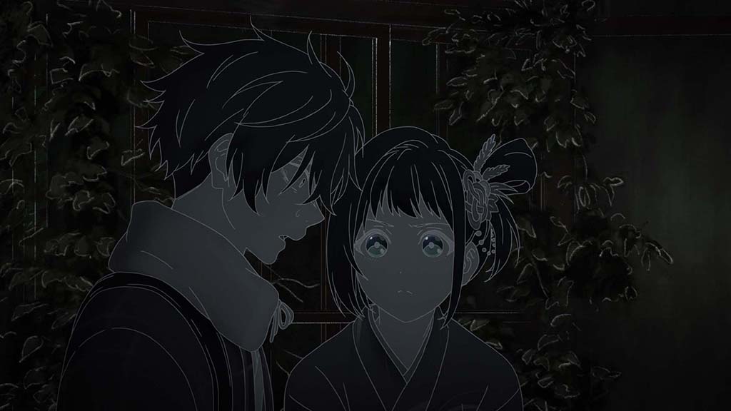
“The dark scenes needed to have a clear sense of dread. However, in anime, what is supposed to be dark is traditionally drawn with surprising brightness. This makes sense, because otherwise it feels like nothing is happening onscreen. I chose to strip the screen of the sense of security that comes with visibility by making the main lines of the animation cels white and removing the intrinsic color of the characters and the background. This way, I plunged the characters into true darkness.”
—Minoru Ota, Director, Sparks of Tomorrow
Bringing light to the world is a core theme of the series, reflected in Kihachi’s fear of darkness. “The dark scenes needed to have a clear sense of dread,” Ota remarks. “However, in anime, what is supposed to be dark is traditionally drawn with surprising brightness. This makes sense, because otherwise it feels like nothing is happening onscreen. I chose to strip the screen of the sense of security that comes with visibility by making the main lines of the animation cels white and removing the intrinsic color of the characters and the background. This way, I plunged the characters into true darkness.”
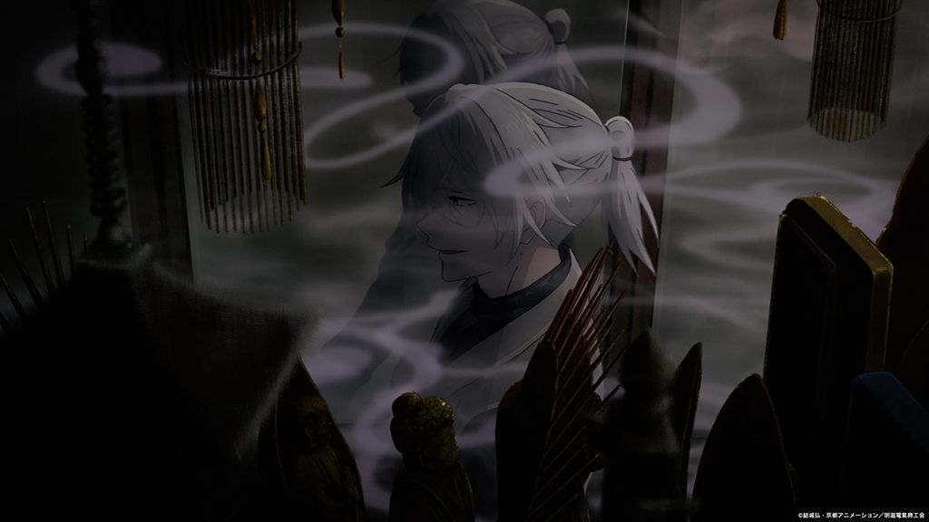
Ota kept instructions to animators as abstract as possible, giving them the freedom to develop their own ideas. “I had many in-depth discussions with each animator until we reached the kind of expression we desired,” Ota notes. “The main staff and I overcame similar challenges in the early stages of production, so I also had their support as we achieved the targeted quality.”
The series primarily relied on 2D animation techniques. “We gave the backgrounds a painterly aesthetic, which made it tough to properly balance alongside digital animation. Angular 3D assets looked out of place next to the fluid brushstrokes of the backgrounds,” Ota explains. “Try taking a photograph and folding it in half. Does it make the image look more three-dimensional? No. The picture is folded, but the image remains flat. Similarly, making 3D elements look natural in 2D animation is not easy and takes specific expertise. I used as little digital animation as possible, and it was made only by a limited few members of the team.”
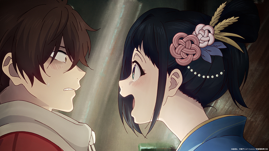
The series contrasts two opposing visual motifs: the unhealthy, suffocating presence of steam and smoke with the clarity and cleanliness of electricity. “Steam and smoke are important to this series,” Ota notes. “I wanted to have both visual impact and high quality, so I asked the backgrounds team to create the materials for the steam and smoke. The compositing team then inlaid those materials in a variety of different patterns and added animation. If you look closely, you can see that we added a little extra color to the smoke so it would harmonize with the background. The steam-filled locations were also designed to reflect Yosuke’s mentality. “He is blessed in both talent and environment, but his continued reliance on Seiroku [Kihachi’s late brother] robs him of opportunities for self-actualization,” Ota says. “Reaching adulthood without fully maturing or realizing one’s potential is actually pretty common, even among people today. We took this common truth and, using Yosuke as a lens, incorporated it into the steam backgrounds.”
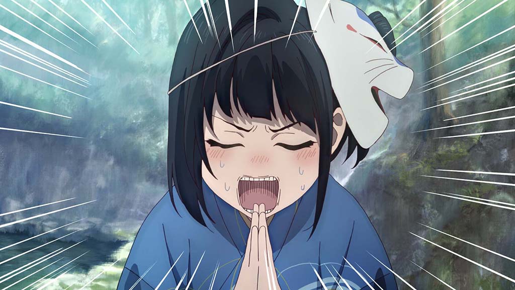
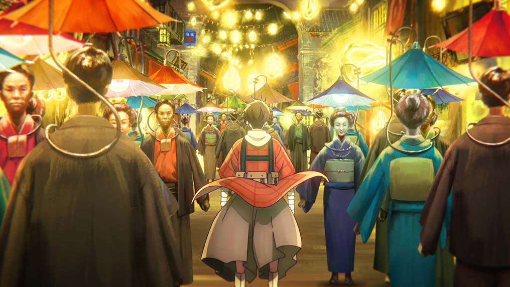
Electricity was designed to affect the people around it. “In contrast to the steam, which we used to convey Yosuke’s state of mind, we wanted the electricity to affect the people around it,” Ota notes. “Kihachi’s inventions only function in the ways we already understand, but they make us feel more hope than that. Lightbulbs cast yellow light onto the people and buildings around them, causing the screen to radiate hope. This has nothing to do with light, but the music in Episode 6 and the screws in Episode 7 convey the same feeling. Any scene in which electricity is present, it is always giving people hope.”
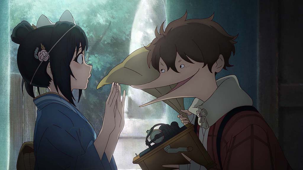
For the series, Kyoto received a steampunk makeover, with the city’s familiar architecture enhanced by an intricate network of steam pipes winding through its streets. “I started by making illustrations of Kyoto’s cityscape for reference and showing it to Mr. Takayama, the art director,” Ota states. “By that point we had already decided on the general shape of the city, which would be mostly the same as the real Kyoto but with additional details like the steam pipes that coil around the streets. We also requested a dark atmosphere that reflects the societal stagnation, and visible brushstrokes to make [the city] look like a painting.”
The initial concept art was dominated by brown tones. While it technically fulfilled the brief, Ota felt that something was missing: “They lacked a sort of beauty. From there, we had our artists try a variety of color patterns, and we decided to use blue as the base for the main city. We chose this for two main reasons. First, it helped convey the right level of darkness. Second, traditional Japanese architecture uses pale wood and gray roof tiles, so pairing that with the blue sky gave the whole city a cool-toned impression. After making final adjustments like deciding how many painterly brushstrokes we wanted to leave in, the city was complete.”
Several locations play an important role in the series, including the Horai Buddhist Altar Shop, the Momokawa family home, and the Mizoe family study room. “Kihachi needed abundant tools and materials with which to work on his various inventions,” Ota explains. “That was why we chose his base to be a shop selling Buddhist ritual implements, which would carry wood, metal and a small amount of chemicals and scientific tools. We based the shop’s glittering, mystical appearance on our observations at a real Buddhist altar shop we visited.” The Momokawa brewery was designed to evoke a different atmosphere. “I had a clear image because it was supposed to be a declining, long-established sake brewery. I visited a sake brewery and a Kyoto estate that matched that image and merged our observations from both for the background art.”
The Momokawa residence, where the family lives, serves as a reminder of the brewery’s former prosperity. “It’s a traditional Kyoto townhouse featuring a Western-style reception room, which was rare at the time, and an elegant room added on as an extension, where a traditional betrothal ceremony is performed in Episode 11,” Ota says. “However, because sake brewing is treated as a sacred profession, I cautioned the artists to make sure the Momokawa residence appeared lavish without feeling tacky.” Yosuke’s room, meanwhile, was modeled on a room in Chourakukan, a historic building. “That building was built slightly later than the time period of this series, but we based the Mizoe Firm on slightly advanced architecture to show the great prosperity it has gained from the extraordinary development of steam engines. Doors and walls have since been renovated in the building, but we recreated its traditional layout in the art.”
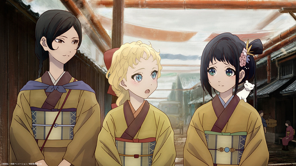
While Kihachi remains skeptical of the world around him, Inako Momokawa is more willing to trust and believe in people, a difference reflected in the series’ shot composition. “We made frequent use of layouts drawn from the angle of a normal lens to produce a sense of realism,” Ota states. “The close-up shots of Inako were meant to convey her earnest and innocent personality. We also wanted viewers to feel the pressure that Kihachi is under.”
One of the most entertaining characters is Inako’s girlfriend, Suzu Harashima, who can pull almost any tool from her purse and move with the speed of a ninja. Ota reveals that “work featuring Suzu Harashima was popular among the animators. They always vied to handle the scenes she appeared in. Honestly, she was at the edge of the level of realism we wanted for the action in this series. Suzu offered more freedom in animation than any other character, and bringing her to life was fun for the animators.”
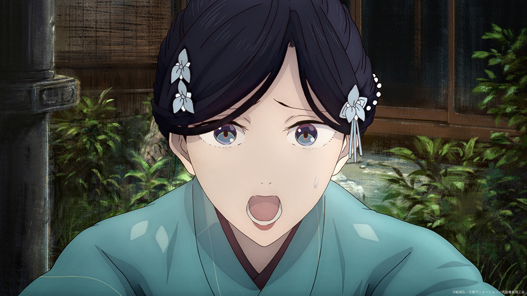
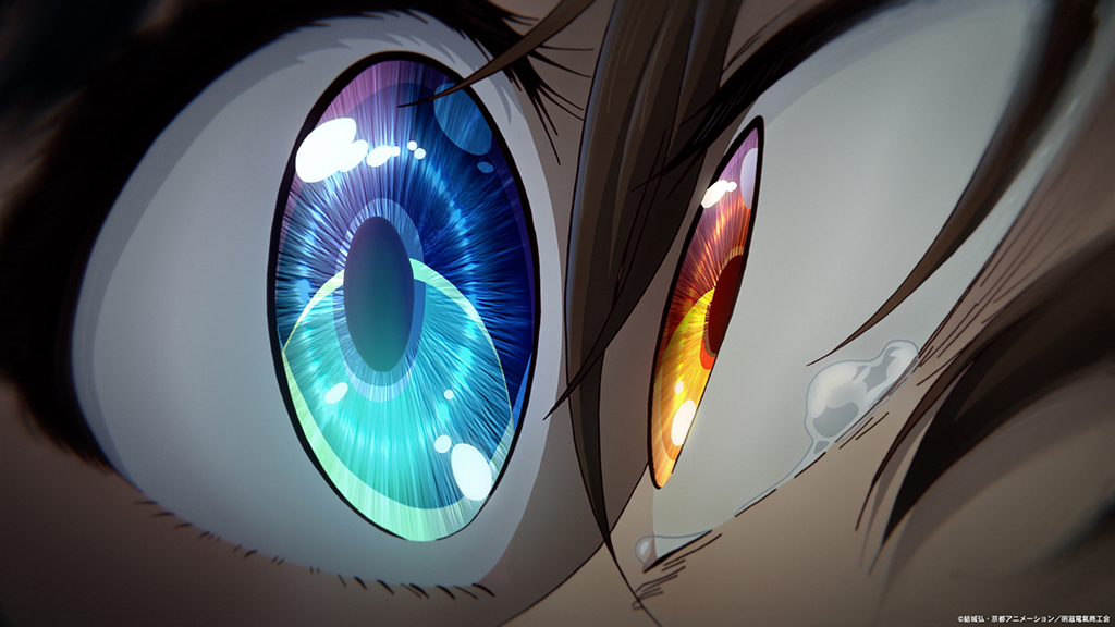
The characters’ eyes also play an important role in conveying their emotions and intentions. “Eyes contain additional information that goes beyond a person’s words. If the person a character is facing is reflected in their eyes, that’s proof they are engaging with them sincerely,” Ota notes. “If a person who isn’t there is reflected in their eyes, that means they aren’t paying attention to the person in front of them. It’s a rather straightforward production technique. The reflection is created by simply placing transparent art of the character atop the eye. However, the compositing team must always consider the brightness of the background and the intent of the scene when adjusting the eye and the reflection to make sure both are visible.”
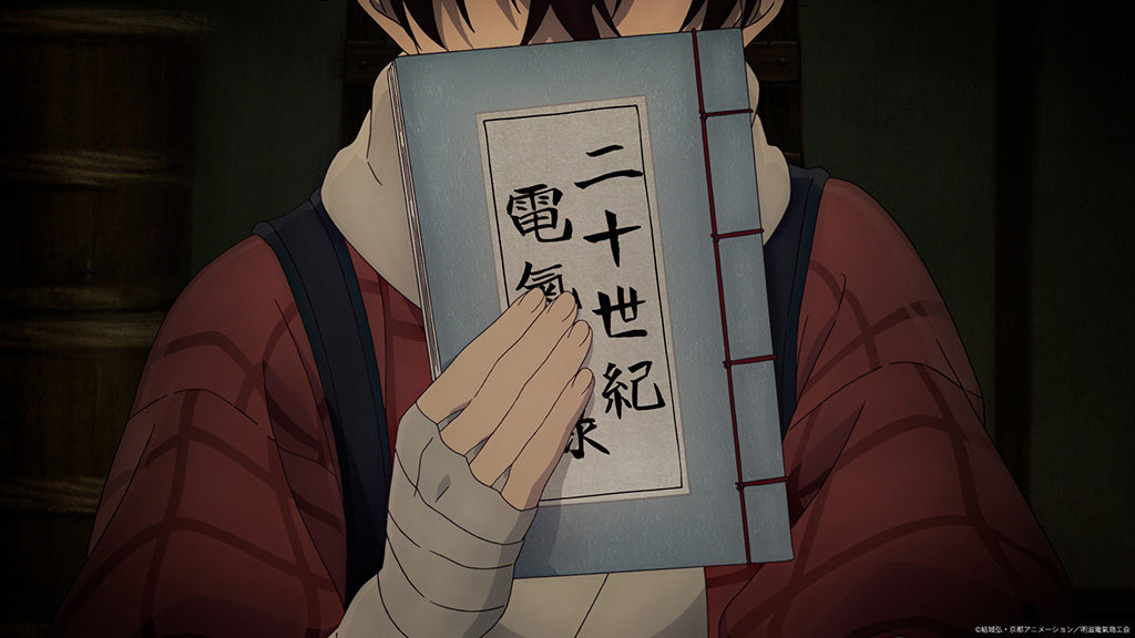
“In contrast to the steam, which we used to convey Yosuke’s state of mind, we wanted the electricity to affect the people around it. Kihachi’s inventions only function in the ways we already understand, but they make us feel more hope than that. Lightbulbs cast yellow light onto the people and buildings around them, causing the screen to radiate hope. This has nothing to do with light, but the music in Episode 6 and the screws in Episode 7 convey the same feeling. Any scene in which electricity is present, it is always giving people hope.”
—Minoru Ota, Director, Sparks of Tomorrow

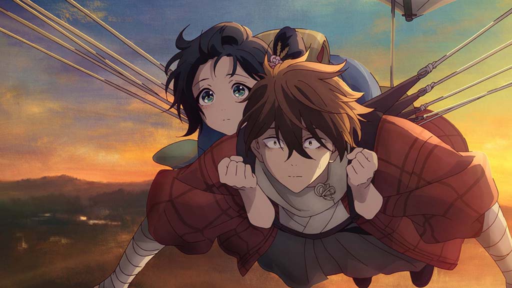
Two particularly memorable moments are Kihachi and Inako’s rooftop escape and the scene in which Inako believes she is going to die at the Horai Buddhist Altar Shop. “We took a comical approach to the rooftop escape scene, but it was important to us that we convey Kihachi and Inako’s fear,” Ota says. “Showing that emotion was how we emphasized the sudden nature of their flight, so we had the scene follow them from takeoff to the sky with as few cuts as possible.” The sequence combines beautiful background art with digital animation that mimics the movement of an actual camera. “The digital art, created through meticulous calculations to assemble background elements into a 3D space, creates a truly stunning overhead view of Kyoto from the kite.”
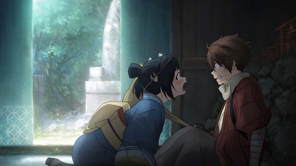
For the scene in which Inako believes she is going to die, the production team wanted steam to serve as an evil force. “For the scene where Inako is convinced she is going to die, we wanted steam to feel like the overarching villain,” Ota says. “The smoky, elusive art is meant to heighten the negative impression and convey Inako’s feelings as she sinks into the abyss. I had the animators draw each frame with the flat side of a pencil to increase the density of the art by analog means.”
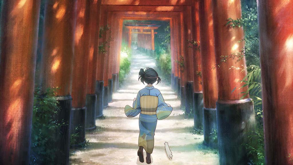
The most complex sequences to produce, however, were those depicting the inner workings of Kihachi’s mind. “Visually expressing genius intellect is no easy task to begin with,” Ota observes. “We added an extra challenge when we decided to create the visuals using harmony cels with the help of the art team. Coloring is normally performed by the painting team, but we gave it to the art team so it would have unique results. Furthermore, some of the cuts required over 100 assets, and because we only had so many artists who could comfortably handle drawing so much art, production took a considerable amount of time.” The production team was determined to use these sequences to explore new forms of visual expression. “After much experimentation, we chose to accomplish this by making the background art the visual centerpiece. Backgrounds occupy the majority of the screen, so we felt that making them unique would give the show a novel visual identity.”
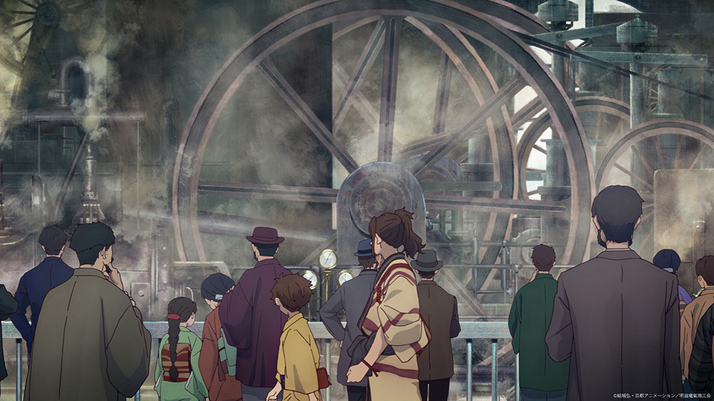
Ota says that approach came with its own challenges. “But drawing the backgrounds in a painterly style created all kinds of problems, like the backgrounds standing out more than the characters, night scenes becoming hard to decipher without careful darkness adjustments, and small shading changes making the city no longer look like Japan. Breaking from anime conventions and taking on this challenge had us mired in unforeseen difficulties right until the end of production.”
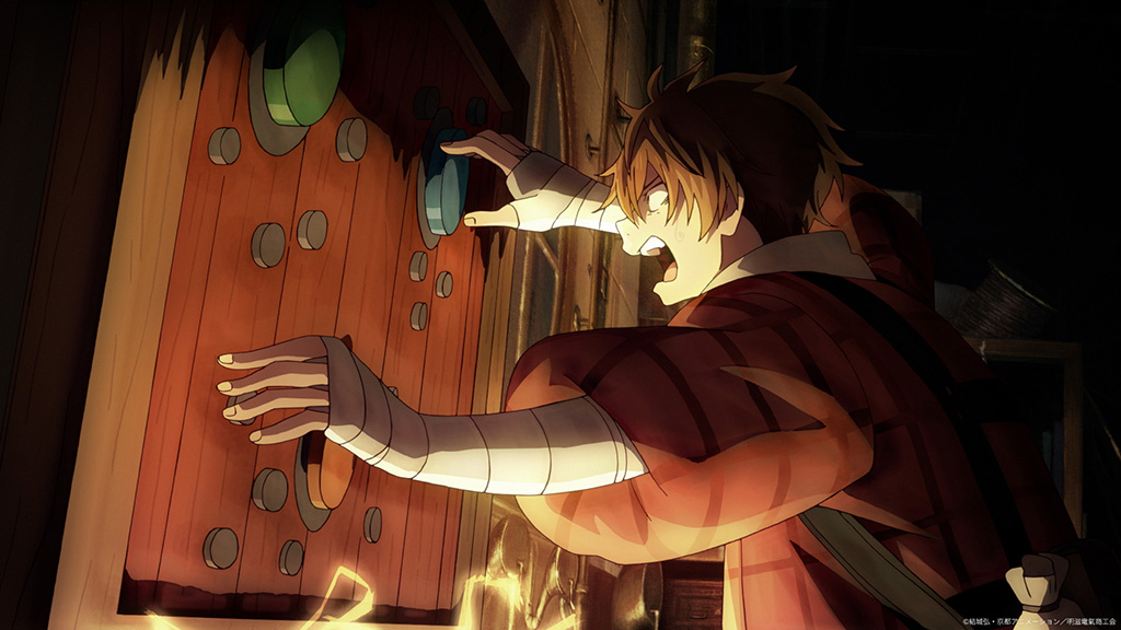
Viewers can look forward to a particularly memorable scene in Episode 12, when one of Kihachi’s inventions finally activates. “It’s an exciting scene with a real sense of romance, where a machine that is like a culmination of all the things Kihachi has made with ‘The 20th Century Electrical Catalog’ finally starts up,” Ota states. “Then, of course, there’s the scene where Inako realizes her dream of brewing sake, and the moment in Episode 12 where Yosuke’s eeriness reaches its peak. I’m looking forward to everyone watching how the characters’ actions intersect in complex ways and come together in the end.”
With Kihachi’s story approaching its final stage, Ota has one last message for viewers: “Thank you very much to everyone who has watched this far. Don’t worry, the remaining episodes will be no less exciting than everything we’ve seen so far. I hope you’ll all look forward to seeing Kihachi’s journey through to the end.”